
When we started planning our year long adventure, we could not find the data we were looking for – data that would give us greater insight and confidence into how a travel year may look day to day and month to month. It was not out of a desire to replicate someone else’s year (an impossible and fruitless task), but to get a feel for how the details pan out over time.
There were no thorough examples online of what day to day finances or budgeting may look like, nor what usual distances were travelled, nor what extent accommodation types were being utilized. Hence this ‘365 Data’ page was one of the main reasons we created our website. After our adventure, we conducted an in depth analysis on: Costs by Country, Accommodation and Activities, and Transportation.
The data we present below has the following context:
A) We are a middle class family who saved heavily and sold our house to enable this adventure, aiming to end living in a different country. We started saving as two working parents with secure jobs living in an average house.
B) Our goal is to travel frugally NOT cheaply. For example, we go to the occasional theme park and do occasional must-see expensive day trips in the areas we visit. However, we always balance these with minimal cost days. We consider lower cost ways to do things even if it means more groundwork (i.e. trip to Patagonia). See our Instagram feed @cakesncampfires for more examples of places we’ve been!
C) We are not sponsored, nor have we been enabled to do this by any ‘jackpot’ (inheritance, lottery, killer app etc,). We are not earning significantly, but some money did flow in after we started, from refunds and items we sold later.
D) We aimed to travel for one year, budgeting $USD50 per person per day. Read the book and background about this target – we are testing it!
Regardless of how you came to the decision or the ability to plan your own adventure, take a look at our numbers. We know the data below answers the questions we had – it may answer yours too. If you have further questions about what is on this page, please ask us in the comments below, that way other visitors can benefit from the discussion.
How much do we utilize each type of accommodation?
There was no way we could afford this trip if we stayed in paid accommodation every night for 365 days. We utilized the generosity of family and friends, and camped when we could to keep accommodation costs lower. We are a family and stay in places more than a few days usually – if we did not have a child and were faster moving we’d use CouchSurfing a lot more!
How far are we traveling on most days?
Depending on the region this graph changed a lot. While in North America we had a car so drove almost daily for considerable distances. On other continents (without a car), our distances were much shorter on most days because we walked or used public transportation.
How often are we under budget or over budget?
Our target spending is $USD 50/person/day, or total daily budget of $USD 150/day… or less! How many days are we actually achieving this goal? Remember, we are not going to avoid paying for experiences if it means going a little over our budget. We want to experience the world by seeing and doing as much as we can, not just tick places off a list. If you click on a pie section it will show the number representing the percentage of days in that category.
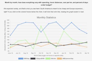
Month by month, how does everything vary with spending, travel distances, cost per km, and percent of days under budget?
We expected variety, and that’s what you see here! South America is meant to be cheap and Europe expensive… right? If you click on the colored boxes below the chart, it will hide that color line, making the graph easier to read.
What single point data do we monitor frequently as we travel?
We have a really messy but colorful spreadsheet that has a lot of interesting stuff on it. Some of it is graphable and presented above, but some of it is singular data.
| Laps of Earth | 2.81 |
| % Days <50km | 0.52 |
| % Days <$150 | 0.70 |
| Average USD per month | 5464 |
| Average USD per person per day | 60 |
| Average USD per day (family of 3) | 181 |
| USD points redeemed | 3432 |
| “Unexpected” expenses | 2857 |
| Average days per location | 3.7 |
Day to day, what does it look like as we travel?
Were we busy daily or not? How did we schedule routine or special things in? HINT: Turn your phone so you are viewing in landscape mode, and click on “+” to expand data. This spreadsheet is fully searchable and exportable for your inner nerd. See our post on how to navigate this spreadsheet.
DAY | DATE | GENERAL LOCATION | NIGHT STAY TYPE | KILOMETRS TRAVELLED | USD COST OF DAY | NOTES AND LINKS |
|---|---|---|---|---|---|---|
| Total | Total Km | Total $ | Average $/Day | |||
| TOTALS ---> | 396 | 112935.066 | 71589 | $180.78 | ||
| 1 | 06-02-18 | USA, CO, Loveland | Private | 0.066 | 50 | On the good advice of friends we did not make it very far. |
| 2 | 06-03-18 | USA, CO, BLM | Camp | 692 | 105 | But this cost total included a pair of shoes. |
| 3 | 06-04-18 | USA, UT, Moab | Camp | 195 | 118 | Topped out at 101*F. Camped in shadow of and east facing canyon wall. Dino prints! |
| 4 | 06-05-18 | USA, AZ, Page | Hotel | 526 | 251 | Eary rise to Delicate Arch. Long drive from Moab - did hotel thing for laundry and smelling better. |
| 5 | 06-06-18 | USA, UT, Zion NP | Camp | 212 | 85 | To Zion NP. The Narrows hike, then back to camp outside east entrance. |
| 6 | 06-07-18 | USA, NV, Las Vegas | Hotel | 362 | 199 | Angels Landing early hike. Target tent-ground closed. 104*F leaving Utah. |
| 7 | 06-08-18 | USA, CA, Long Beach | Private | 450 | 60 | Unpacked and repacked to improve the fit>function problem in our car. This should reduce frustration. |
| 8 | 06-09-18 | USA, CA, Westminister | Private | 18 | 31 | Ballast Point gathering. |
| 9 | 06-10-18 | USA, CA, Costa Mesa | Private | 57 | 74 | Caught up with friends. Took a slower and easier day. |
| 10 | 06-11-18 | USA, CA, Long Beach | Private | 85 | 317 | Legoland tickets aquired. It may be the only theme park visit. |
| 11 | 06-12-18 | USA, CA, Carlsbad | Private | 137 | 102 | Easy morning then headed south in afternoon. |
| 12 | 06-13-18 | USA, CA, Long Beach | Private | 135 | 101 | Day at Legoland! |
| 13 | 06-14-18 | USA, CA, Cambria | Private | 404 | 60 | Morning packing and sorting wesite things. Long drive north up the coast. |
| 14 | 06-15-18 | USA, CA, Cambria | Private | 65 | 62 | Hearst Castle, seals, zebras |
| 15 | 06-16-18 | USA, CA, San Francisco | Private | 440 | 235 | Aquarium visit |
| 16 | 06-17-18 | USA, CA, San Francisco | Private | 33 | 123 | Trolley, Union square, Painted Ladies, buses, Presidio Picnic, friend toured us, Coit Tower, Mission District, Wes Burgers. |
| 17 | 06-18-18 | USA, CA, San Francisco | Private | 23 | 189 | Bay cruise, Pier 39, Jack’s at Cannery, Chocolate square, Safeway!, rooftop views. |
| 18 | 06-19-18 | USA, CA, Napa Valley | Camp | 173 | 420 | Muir Woods, bridge, Sausalito, Santa Rosa, Russian River, Wine country, Cell Phone Bill |
| 19 | 06-20-18 | USA, OR, Collier SP | Camp | 571 | 70 | Drove all day up I5 into Oregon. |
| 20 | 06-21-18 | USA, OR, Portland | Private | 528 | 122 | Crater Lake then to Portland. Long day and drive. |
| 21 | 06-22-18 | USA, OR, Portland | Private | 370 | 112 | Mt St Helens day trip |
| 22 | 06-23-18 | USA, WA, Anacortes | Private | 692 | 187 | Long drive day indeed! Hops, egg, waterfalls, roads. |
| 23 | 06-24-18 | USA, WA, Anacortes | Private | 0 | 120 | First true rest day! |
| 24 | 06-25-18 | CANADA, Victoria | Private | 230 | 180 | Over to the island, capital, family, tour, dinner |
| 25 | 06-26-18 | USA, WA, Blaine | Private | 206 | 199 | Capilanos Suspension Bridge |
| 26 | 06-27-18 | CANADA, Kamloops | Hotel | 495 | 37 | Long drive, waterfalls, Whistler drive through |
| 27 | 06-28-18 | CANADA, Banff NP | Camp | 498 | 143 | Johnston Canyon, evening waterfall hike |
| 28 | 06-29-18 | CANADA, Banff NP | Camp | 177 | 68 | Upper and Lower Falls, Castle Mountain Camp, Lake Louise, Emerald Lake, Takakkaw Falls, Spiral Tunnels |
| 29 | 06-30-18 | CANADA, Banff NP | Camp | 118 | 105 | Banff downtown, Two Jacks Lake, Banff Elk Bar, gardens, new matching rings $9. |
| 30 | 07-01-18 | USA, MT, Kalispell | Couchsurfing | 540 | 164 | First couch surfing, after experiencing C-Day! Up early to Lake Louise, no canoe :(, saw parade, gondola ride |
| 31 | 07-02-18 | USA, MT, Glacier NP | Camp | 127 | 154 | Scrambled to get site at Avalanche Camp. Drove to visitor at divide. Hiked to lake. |
| 32 | 07-03-18 | USA, MT, Glacier NP | Camp | 129 | 39 | Hit 5000 miles. Saw the sights of Glacier NP. |
| 33 | 07-04-18 | USA, ND, Steele | Hotel | 1253 | 401 | Car servicing. Long drive across prairie. Bismark fireworks. Big crane statue. |
| 34 | 07-05-18 | USA, MN, Crosby | Private | 505 | 114 | Upload and website surge. Drive to MN and lakes. |
| 35 | 07-06-18 | USA, MN, Crosby | Private | 127 | 156 | Kayak ride in pm. Easy and local day. |
| 36 | 07-07-18 | USA, WI, Rome | Camp | 810 | 247 | Sculpture and MOA in Minneapolis, drive to camp. |
| 37 | 07-08-18 | USA, IN, Dunes NP | Camp | 315 | 125 | JellyBelly and Mars Cheese Castle, then to Indiana Dunes NP camp. |
| 38 | 07-09-18 | USA, OH, Huron | Private | 434 | 128 | Explored IN Sand Dunes, Jr. Ranger Badge, Catawba Island Brewing Co. and island visit, then drove to Sandusky |
| 39 | 07-10-18 | USA, OH, Medina | Private | 114 | 123 | Cedar Point all day. |
| 40 | 07-11-18 | USA, OH, Medina | Private | 15 | 78 | Rest and paperwork day, besides some ice cream! |
| 41 | 07-12-18 | USA, OH, Medina | Private | 130 | 109 | Scavenger hunt on the Square, Brewery, dinner, Edgewater beach music/walk, gift card |
| 42 | 07-13-18 | USA, OH, Medina | Private | 237 | 118 | Festival of Sails, Scene75, Music in the park |
| 43 | 07-14-18 | USA, OH, Garfield Heights | Private | 69 | 43 | Art Museum and lunch, party! |
| 44 | 07-15-18 | USA, OH, Medina | Private | 105 | 119 | Video intro and month one recap recording |
| 45 | 07-16-18 | USA, OH, Medina | Private | 29 | 150 | Vaccinations (delayed round) then a quiet afternoon. Shoes for MJ. |
| 46 | 07-17-18 | USA, OH, Medina | Private | 32 | 287 | Local stores, quiet day paperwork stuff. Friends for dinner drinks locally. Online orders. |
| 47 | 07-18-18 | USA, OH, Medina | Private | 124 | 33 | Family visit, Aladdins cafe is awesome, University Circle salsa, 8000miles |
| 48 | 07-19-18 | USA, OH, Medina | Private | 38 | 135 | Repack car, then family dinner |
| 49 | 07-20-18 | USA, OH, Burr Oak | Camp | 325 | 146 | Medina farewell, clothes purchase, Wedding |
| 50 | 07-21-18 | USA, OH, Burr Oak | Camp | 150 | 127 | Athens, beer fest, reception, |
| 51 | 07-22-18 | USA, OH, Hilliard | Private | 219 | 86 | Breakfast Athens, christening, hocking hills sp, Arby’s exit error. |
| 52 | 07-23-18 | USA, OH, Hilliard | Private | 45 | 23 | Quiet day by the pool! |
| 53 | 07-24-18 | USA, OH, Hilliard | Private | 90 | 79 | CoSci all day. Four Strings and Olive Tree date. |
| 54 | 07-25-18 | USA, OH, Hilliard | Private | 89 | 1790 | Car front bearings, ball joints, 2 tyres. Yep. |
| 55 | 07-26-18 | USA, OH, Hilliard | Private | 43 | 33 | Quiet day, then afternoon around CoSi parks. Brewery on way home. |
| 56 | 07-27-18 | USA, OH, Hilliard | Private | 52 | 145 | Day at the Zoo! |
| 57 | 07-28-18 | USA, OH, Hilliard | Private | 67 | 653 | Poolside, packed, escaped a room, fancy dinner. |
| 58 | 07-29-18 | USA, KY, Mammoth Caves NP | Camp | 519 | 166 | Early on road. Visited GJ, then saw Abe Lincoln birthplace. Mammoth Cave NP D&D. |
| 59 | 07-30-18 | USA, TN, Seven Points | Camp | 179 | 136 | Historic Tour in cave. Then to Nashville scrambling for and to night camp. Broadway. |
| 60 | 07-31-18 | USA, TN, Seven Points | Camp | 91 | 235 | Swapped sites. G’ole Op. tour, Monells for lunch, Parthenon and gardens. Downtown. |
| 61 | 08-01-18 | USA, NC, Turkey Creek | Camp | 411 | 163 | Gen. A Jackson Hermitage, then E to Smoky Mtns. Took US 129 aka Tail of the Dragon. |
| 62 | 08-02-18 | USA, NC, Mills River | Private | 185 | 120 | Wet tent. Wheels Though Time museum. UpCpuntry brewery. New Belgium tour. Wagon accommodation. |
| 63 | 08-03-18 | USA, NC, Mills River | Private | 119 | 677 | Carl Sandburg House, Sierra Nevada Brewery, Pinball Museum + arcade, drum circle in Asheville. Wagon accommodation. Bought and shipped Applacian dulcimer. |
| 64 | 08-04-18 | USA, VA, Hillsville | Hotel | 384 | 203 | Anniversary. Fish hatchery, Pisgah SP (Cradle of Forestry), ice cream, Blue Ridge Parkway. Long drive in pm. |
| 65 | 08-05-18 | USA, VA, Salthouse Branch | Camp | 228 | 114 | Drove to Roanoke met family at Big Lick Bewing, then ice cream and bluegrass in park. Late into camp at edge of lake. |
| 66 | 08-06-18 | USA, VA, Salthouse Branch | Camp | 232 | 66 | Easy morning then pm to Galax for youth comp in 83rd Old Fiddlers Convention. Home in dark. (70mi ea way) |
| 67 | 08-07-18 | USA, PA, Hershey | Camp | 583 | 255 | Long drive north into PA. Visited Natural Bridge SP in VA. Math battle in car. |
| 68 | 08-08-18 | USA, PA, Hershey | Camp | 45 | 140 | Hershey and all things chocolate. Pool in late afternoon. It is hot! |
| 69 | 08-09-18 | USA, PA, Hershey | Camp | 37 | 141 | Quiet day at camp and pool. Car oil change and sound diagnostics. Gardens and butterflies in pm. |
| 70 | 08-10-18 | USA, NY, NYC | House Swap | 273 | 749 | NY parking = $185 for 5 days. Drove 3+hr Hershey to NY; big change of scene. Stopped at Sri Venkateswara Temple for a culture moment. Bought NY CityPASS. Empire State top deck visited. Expensive day: to budget now would be $30 per day. |
| 71 | 08-11-18 | USA, NY, NYC | House Swap | 18 | 142 | Subway to 110th St to walk south in Central Park. Gugenheim Museum, then spots in CP to see. Rockerfeller Ctr and Lego store, then dinner and home. Use toilets hen you have them is lesson of tailends of the day. |
| 72 | 08-12-18 | USA, NY, NYC | House Swap | 2 | 153 | Most of day at Intrepid Museum. Quiet afternoon and rest, organized. |
| 73 | 08-13-18 | USA, NY, NYC | House Swap | 24 | 65 | Walked to be wet at the MET. Subway to be lost at 9/11 transit center. Green line closed so ferry for 3rd rabies shot. Walked Hoboken to N ferry then to apt. |
| 74 | 08-14-18 | USA, NY, NYC | House Swap | 25 | 96 | Metro card, S&C tour costs. Liberty Island and Ellis Island. Charging Bull and Wall St, |
| 75 | 08-15-18 | USA, NY, Barryville | Camp | 200 | 66 | High Line walk, S&C tour, then NYC exit. To camp at 8:15pm/dusk. |
| 76 | 08-16-18 | CANADA, Niagara | Camp | 340 | 292 | Niagara tours etc tickets, gas, camping x2 nights. Walked area saw fireworks. |
| 77 | 08-17-18 | CANADA, Niagara | Camp | 18 | 141 | Big day of everything Niagara Falls! Poured rain around midnight. |
| 78 | 08-18-18 | USA, PA, McKean | Camp | 243 | 205 | Phone bill. |
| 79 | 08-19-18 | USA, PA, Portersville | Camp | 133 | 123 | Drive to camp close to Pittsburgh, down day at camp pool |
| 80 | 08-20-18 | USA, NC and CO | Camp | 1400 | 104 | Airport and flight for PJ+AJ. Bycycle Heaven Museum, long drive SE. |
| 81 | 08-21-18 | USA, NC and CO | Camp | 5 | 55 | Split day: MJ ECoast, PJ+AJ in CO. Quiet read day GWNF. |
| 82 | 08-22-18 | USA, MD and CO | Camp | 272 | 115 | Split day: MJ ECoast, PJ+AJ in CO. Paw Paw Tunnel, Antietam NP then KOA. |
| 83 | 08-23-18 | USA, MD, Ellicott | Camp | 1214 | 914 | Split day: MJ ECoast, PJ+AJ in CO. Harper’s Ferry NP, then blind navig drive to Baltimore. 11:30pm airport. Prescriptions. |
| 84 | 08-24-18 | USA, MD, Ellicott | Camp | 44 | 193 | Winged it in Baltimore: Orioles tour, Inner Harbor, Orioles game |
| 85 | 08-25-18 | USA, MD, North Potomac | Private | 105 | 6 | Fort McHenry National Historic Place. Drove to near D.C. |
| 86 | 08-26-18 | USA, MD, North Potomac | Private | 39 | 624 | Urgent care for MJ and Visas for next stop. |
| 87 | 08-27-18 | USA, MD, North Potomac | Private | 61 | 165 | Smithsonian in the heat after Arlington. Metro for transport. |
| 88 | 08-28-18 | USA, DC, DC | Hotel | 34 | 207 | Lincoln, Mall, Air & Space, Holocaust vs Spy Museum, Night BigBus tour |
| 89 | 08-29-18 | USA, VA, Barboursville | Private | 177 | 386 | White House view and visitor center, Navy Square, Newseum, Jefferson Memorial, drove into VA. Booked flights (credit points REDEEMED $1800 on this) and transits. |
| 90 | 08-30-18 | USA, VA, Barboursville | Private | 69 | 181 | Coffee break for parents after child meltdown in a.m. Scale down gear pass #1. Brewery with family for dinner. |
| 91 | 08-31-18 | USA, VA, Barboursville | Private | 195 | 83 | Shenandoah National Park, Blue Mountain Brewery, Family time. |
| 92 | 09-01-18 | USA, VA, Barboursville | Private | 82 | 132 | Madison township street fair. Hortons and Barboursville wineries. |
| 93 | 09-02-18 | USA, VA, Barboursville | Private | 121 | 140 | Polo match with wine, then brewery in Crozet. Late night at house. |
| 94 | 09-03-18 | USA, VA, Barboursville | Private | 84 | 68 | Monticello visit |
| 95 | 09-04-18 | USA, VA, Barboursville | Private | 0 | 189 | Home day. Bought travel phone. Decisions and applied health insurance and banking. |
| 96 | 09-05-18 | USA, VA, Barboursville | Private | 18 | 99 | More of yesterday, but today. (Oz visa $ excluded) |
| 97 | 09-06-18 | USA, VA, Barboursville | Private | 14 | 207 | Flu shots, general purchase items. Another day of organization |
| 98 | 09-07-18 | USA, VA, Barboursville | Private | 66 | 56 | Charlottesville downtown statues, got gas in car. |
| 99 | 09-08-18 | USA, VA, Barboursville | Private | 63 | 40 | Groceries and day of organizing. Did the major pack trial of bags to go international. |
| 100 | 09-09-18 | USA, VA, Barboursville | Private | 103 | 0 | Breakfast with friends, then more organization for departure. Shenandoah NP last Jr Ranger! Organized car transferral. |
| 101 | 09-10-18 | USA, VA, Barboursville | Private | 17 | 167 | Last day in US. Box shipped was only cost. Ouch. NA km total: 22577 |
| 102 | 09-11-18 | Overnight flight | Transit | 10145 | 335 | Up early to Charlotte. VA for Amtrak train to DC. Health clinc last vaccination with pharmacy drama. Uber x3 today. Flight to Rio |
| 103 | 09-12-18 | BRAZIL, RIO, Joa | House Swap | 39 | 30 | Landed in Rio, battled smartphone setup for too long, Uber to house from GIG. |
| 104 | 09-13-18 | BRAZIL, RIO, Joa | House Swap | 31 | 2361 | (Costs transits to end of month = $2165). Copacabana: appt then beach late afternoon. |
| 105 | 09-14-18 | BRAZIL, RIO, Joa | House Swap | 3 | 345 | La Playa, Supermercado, homework on a Brazilian deck. 3x tour tickets and phone management. |
| 106 | 09-15-18 | BRAZIL, RIO, Joa | House Swap | 80 | 28 | Tour 7 hrs: Glder beach, national park hike, Chinese View, Christo Redeemer, Santa Teresa, arts locality, Selaron steps. |
| 107 | 09-16-18 | BRAZIL, RIO, Joa | House Swap | 28 | 24 | Ipanema Beach then Botanical Gardens. Then a WiFi, uber and cash debacle. |
| 108 | 09-17-18 | BRAZIL, Rio de Janerio | Hotel | 41 | 352 | Easy morning, then after lunch exited. Francisco paid $315, Uber $20. |
| 109 | 09-18-18 | BRAZIL, Foz do Iguaçu | Hotel | 1184 | 106 | Luggage costs for internal flights, mini bar!, dinner were costs. Tarmac walk at Foz airport. |
| 110 | 09-19-18 | BRAZIL, Foz do Iguaçu | Hotel | 24 | 36 | Trip into town to the supermarket. Poolside and easy day with pm thunderstorms. |
| 111 | 09-20-18 | BRAZIL, Foz do Iguaçu | Hotel | 1 | 49 | Organized tours, rainy day. Walked trail. Updated website and YouTube etc/ |
| 112 | 09-21-18 | BRAZIL, Foz do Iguaçu | Hotel | 27 | 196 | Brazil - Iguazu National Park; big expense was 3 in boat ride ($135) |
| 113 | 09-22-18 | BRAZIL, Foz do Iguaçu | Hotel | 76 | 86 | Argentina - Iguazu National Park |
| 114 | 09-23-18 | BRAZIL, Foz do Iguaçu | Hotel | 3 | 22 | Parque das Aves in moning, then poolside for the afternoon. |
| 115 | 09-24-18 | BRAZIL, Foz do Iguaçu | Hotel | 20 | 113 | Pool then thundering rain midday. Napped!! Then Rafain Churrascaria Show late dinner. |
| 116 | 09-25-18 | BRAZIL, Foz do Iguaçu | Hotel | 0 | 0 | Math and spelling and history tasks. Website photos and poolside games. Expenses to hotel account (food) |
| 117 | 09-26-18 | Overnight flight | Transit | 833 | 229 | Exit bill for the hotel - an exta $28/day incurred (meals, drinks, towels, laundry etc) |
| 118 | 09-27-18 | PERU, Cusco | Hotel | 5181 | 138 | Flew overnight and arrived Cusco about 3pm. Whirlwind to hotel and then groceries. |
| 119 | 09-28-18 | PERU, Cusco | Hotel | 7 | 1035 | Walked to Centro Historico, Choco Museo and bean-chocolate class (2hr), booked next 7days |
| 120 | 09-29-18 | PERU, Cusco | Hostel | 27 | 24 | Changed accommodation. The 1/2 day city tour. |
| 121 | 09-30-18 | PERU, Cusco | Hostel | 195 | 22 | Full 12hr day tour of region. |
| 122 | 10-01-18 | PERU, Cusco | Hostel | 3 | 94 | Scouted out some classes (coffee, weaving), laid low in p.m. updating website |
| 123 | 10-02-18 | PERU, Aguas Calientes | Hostel | 111 | 28 | Bus and train to Aguascalientes in prep for MP tomorrow |
| 124 | 10-03-18 | PERU, Cusco | Hostel | 114 | 61 | Machu Picchu! The almost missed train back, bus pickup mayhem, back to Cusco |
| 125 | 10-04-18 | PERU, Cusco | Hostel | 3 | 70 | Slept in. Four small museums in pm. |
| 126 | 10-05-18 | PERU, Cusco | Hostel | 8 | 28 | Museum, monument, lunch, market strolling, San Blas Temple area. |
| 127 | 10-06-18 | PERU, Cusco | Hostel | 4 | 422 | More organizing for next week. Bought lake T tickets, paid accommodation. Starbucks. |
| 128 | 10-07-18 | PERU, Cusco | Hostel | 56 | 27 | Tour: Church of Andahuaylillas (the Sistine of SA), pre-Inca site Pikillacta, then Tipon water site. Then nap vs postcards. |
| 129 | 10-08-18 | PERU, Cusco | Hostel | 6 | 89 | Public holiday, walked sa parade, no mail or lutherie. Lunch, dinner beer @ Hanz. Got sweaters! |
| 130 | 10-09-18 | PERU, Cusco | Hostel | 3 | 72 | Mailed postcards, updated things on website, strolled markets. PJ got sweater. |
| 131 | 10-10-18 | PERU, Bus Hop to Puno | Transit | 394 | 66 | Left hotel, wandered Cusco until 8pm, dinner over square, 9:30pm bus. |
| 132 | 10-11-18 | PERU, Amantani Island | Private | 49 | 19 | Arrived Puno, van to boat on Lake Titicaca. Amantani Island homestay and hike up to 2 mountains. Lunch/dinner. “Disco in evenng. |
| 133 | 10-12-18 | PERU, Bus Hop to Cusco | Transit | 442 | 36 | Taquile Island walk and lunch. Long boat across bay. Entrada Universitia parade. Bus to Cusco overnight. |
| 134 | 10-13-18 | PERU, Cusco | Hostel | 2 | 135 | To accom 5:15 so slept in. Lunch with talented musical duo. Coffee and early night. $50 ads/10days |
| 135 | 10-14-18 | PERU, Cusco | Hostel | 3 | 208 | Got trek supplies, map, fuel, socks. Bus tickets to SE region. |
| 136 | 10-15-18 | PERU, Cusco | Hostel | 3 | 1612 | 54 pre bookings...Bought charger for camp. Taco mania! Coffee upload. Booked November travel. [credit points REDEEMED $397] |
| 137 | 10-16-18 | PERU, Cusco | Hostel | 2 | 117 | Visas preparation. Bus fee to Uyuni. Website posts and scheduling. Drama of trying to print on WiFi. |
| 138 | 10-17-18 | PERU, Cusco | Hostel | 14 | 693 | 568 prior to hostel costs (laund + room). Bolivia visas drama. |
| 139 | 10-18-18 | PERU, Ausangate Mountain | Camp | 131 | 20 | Local bus to Tinki, taxi to Upis. Hiked 5km and set up in an alpaca corral! |
| 140 | 10-19-18 | PERU, Ausangate Mountain | Camp | 12 | 3 | Long hard day 12 km, one pass, wrong side of lake, rained, not to camp. Pablo saved the day. Snowed overnight. |
| 141 | 10-20-18 | PERU, Ausangate Mountain | Camp | 2 | 3 | Went one mile. Yesterday took toll so had easy rest day. |
| 142 | 10-21-18 | PERU, Ausangate Mountain | Camp | 5 | 3 | Over Ausangate Pass to Ausangate Lake by late morning. |
| 143 | 10-22-18 | PERU, Ausangate Mountain | Camp | 150 | 66 | Sunrise, Senora swindle, sat by lake, glacier cleaving, long downhill to bus luck. |
| 144 | 10-23-18 | PERU, Cusco | Hostel | 2 | 174 | Sore tired legs. Coffee shop and edu time for AJ. Quiet afternoon and evening. Big laundry! Bought little flag badges. Paid accom for next 5 days. |
| 145 | 10-24-18 | PERU, Cusco | Hostel | 0 | 27 | Big laundry and some didn’t come back until requested. Low quiet day, still recovering. WhatsApped friends. Website stuff. |
| 146 | 10-25-18 | PERU, Cusco | Hostel | 2 | 338 | Taxes and other fun bureaucracies. KFC lunch for AJ. Early bed for tomorrow adventure. ElC AirBNB. |
| 147 | 10-26-18 | PERU, Cusco | Hostel | 216 | 24 | 3am start to Rainbow Mountain. Last full day in Cusco. |
| 148 | 10-27-18 | Overnight bus | Transit | 392 | 45 | Hung out. Simple day. Bag snatched at bus stop but retrieved. Bus to Puno |
| 149 | 10-28-18 | BOLIVIA, Copacobana | Hostel | 144 | 62 | Puno breakfast then bus sit/sleep a few hours. The to Bolivia border and Copacobana. Hill. Groovy hostel, walked town, dinner. |
| 150 | 10-29-18 | BOLIVIA, Copacobana | Hostel | 34 | 143 | Prolly best hostel don’t town ever. So far maybe! Slack line, alpaca, Isle de Sol trip, steep walk up lookout or sunset and city view. Paid 2 night accom. |
| 151 | 10-30-18 | BOLIVIA, La Paz | Hotel | 145 | 42 | Paddle boat, inflatable foller thing, poncho museum, relaxed. Then bus to La Paz at night. |
| 152 | 10-31-18 | BOLIVIA, La Paz | Hotel | 8 | 83 | City walking tour (excellent), and then walked for bus ticket and markets. Early dinner and drinks. Halloween masks! |
| 153 | 11-01-18 | Overnight bus | Transit | 540 | 143 | Cable car red and blue lines. La Paz Cemetry. Video editing for website. Night bus prep. |
| 154 | 11-02-18 | BOLIVIA, Uyuni | Hotel | 4 | 64 | Coffee x2 as poor sleep. Editing and quiet day. Museo de Trans not open. Dinner at Lithium as Lliphi not open today. |
| 155 | 11-03-18 | BOLIVIA, Jukil | Hotel | 140 | 58 | Salt Flat tours Day one: salt flat, Incahuasi (fish) Island, salt hotel, photo fun, salt market Colchani village, train graveyard, Ajencha |
| 156 | 11-04-18 | BOLIVIA, Termas de Polques | Hostel | 290 | 64 | Salt Flat tours Day two: volcanoes, lagoons, geysers, Galaxy Cave and formations, Rock Tree, Laguna Colorado, flamingos, hot springs. |
| 157 | 11-05-18 | Overnight bus | Transit | 365 | 94 | Salt Flat tours Day three: Dali Desert, Green and White Lagoon, Hidden Valley in lava field, Chile border. Dinner in Uyuni at Lliphi, then bus to Sucre. |
| 158 | 11-06-18 | BOLIVIA, Sucre | AirBNB | 4 | 122 | Recovery day after 4 long but fun days in SW Bolivia! Groceries and brief walk in main city square area. |
| 159 | 11-07-18 | BOLIVIA, Sucre | AirBNB | 4 | 31 | School work fun! Walked to Bolivar Park playground but drizzzle. Groceries. 5 hrs to midnight trying to sort Patagonia trek. |
| 160 | 11-08-18 | BOLIVIA, Sucre | AirBNB | 3 | 621 | AJ vomit sick. PJ finger slick. Quiet day. Patagonia camp sites... not cheap. At one, 3 basic beds =$320, as camping full. |
| 161 | 11-09-18 | BOLIVIA, Sucre | AirBNB | 17 | 40 | Parque Cretacio! Then Parque Simon Bolivar again for dry Dino slide etc. Quiet evening with a local red wine. |
| 162 | 11-10-18 | BOLIVIA, Sucre | AirBNB | 8 | 110 | Coffee and brunch (And dinner show referral) and park again. Cathedral tour, shops, Recoleta tour. Dinner show was awesome! |
| 163 | 11-11-18 | BOLIVIA, Sucre | AirBNB | 5 | 20 | Doubles strategies mayhem morning. Then walked Central Market, AJ ‘Lego‘. Sat in Plaza 25. Photos and CEUs. Night walk but music bars not open. |
| 164 | 11-12-18 | BOLIVIA, Sucre | AirBNB | 12 | 110 | Sombrero museum + factory, JoyRide for lunch, Museo Anatomica, Museo del Tosorio, Churro Monky, main square photos. Long day. |
| 165 | 11-13-18 | BOLIVIA, Sucre | AirBNB | 9 | 65 | Castle of the Glorieta, Indigenous Art Museum. Lunch and then later drinks. |
| 166 | 11-14-18 | ARGENTINA, Buenos Aires | Hotel | 2289 | 148 | Travel day. Sucre to Sata Cruz to Buenos Aires. You need an exit ticket to enter ARG. Sat on airport floor to work that one out. |
| 167 | 11-15-18 | ARGENTINA, El Calafate | AirBNB | 1323 | 540 | Glacier tickets for weekend. Groceries and transitions in El Carafate. Wind lean photos. Early (4:15am) start in new time zone. |
| 168 | 11-16-18 | ARGENTINA, El Calafate | AirBNB | 6 | 2225 | Exit flights from ARG. Souviners, socks, Yeti Bar, groceries, lunch fun day stuff. |
| 169 | 11-17-18 | ARGENTINA, El Calafate | AirBNB | 27 | 106 | Late start. No wind! For a while. Bikes rented for along bay edge. Then Evita toy museum. La Zorro brewery again - others not open. Picked up laundry. |
| 170 | 11-18-18 | ARGENTINA, El Calafate | AirBNB | 309 | 91 | Glacier boat cruise all day - 7:30 to 7:30. Awesome! |
| 171 | 11-19-18 | ARGENTINA, El Calafate | AirBNB | 5 | 295 | Bus tickets for return from Torres del Paine, and some groceries. Pizzarea Napolean for late lunch. |
| 172 | 11-20-18 | CHILE, Puerto Natales | Hotel | 275 | 720 | Bus all morning to Puerto Natales. Walked through town area. An expensive area to stay at due to remoteness. |
| 173 | 11-21-18 | CHILE, Puerto Natales | Hotel | 4 | 83 | Walk tour of town. Noodle lunch. School time then to 3 local parks. Early dinner. |
| 174 | 11-22-18 | CHILE, Puerto Natales | Hotel | 5 | 106 | Parks for play time. Met with Salt Flat friends for dinner - Thanksgiving! |
| 175 | 11-23-18 | CHILE, Puerto Natales | Hotel | 4 | 66 | Slow going day. Downtwn walk and explore. Uploaded photo albums. |
| 176 | 11-24-18 | CHILE, Puerto Natales | Hotel | 56 | 123 | Trip to see Miradon Cave. Quiet afternoon then dinner and drinks. |
| 177 | 11-25-18 | CHILE, Puerto Natales | Hotel | 4 | 128 | Bus tickets to/inside park. Played in park on hill. Then groceries, info session at Erratic Rock, dinner next door at Base Camp. |
| 178 | 11-26-18 | CHILE, Puerto Natales | Hotel | 5 | 74 | Morning runs. School time. Last groceries and items for hike. |
| 179 | 11-27-18 | CHILE, Puerto Natales | Hotel | 5 | 75 | Test packing of stuff for big few days coming up. |
| 180 | 11-28-18 | CHILE, Torres del Pine NP | Camp | 144 | 36 | Up early 7:15 bus to Torres del Pine NP to campsite. Luggage storage and some food were costs. Hiked to/from large lake edge. |
| 181 | 11-29-18 | CHILE, Torres del Pine NP | Camp | 23 | 1 | Only cost was a restroom at Chileano. Long full day hike up to the torres/towers and then back down; 23km/10hrs. |
| 182 | 11-30-18 | CHILE, Torres del Pine NP | Camp | 13 | 30 | Long rolling hills, with fun wind, then relaxed at camp. Showers! Dinner then bed in the daylight. |
| 183 | 12-01-18 | CHILE, Torres del Pine NP | Camp | 11 | 0 | Short hike to Italiano, then hiked to Frances Lookout to watch glacier cleaving. |
| 184 | 12-02-18 | CHILE, Torres del Pine NP | Camp | 21 | 85 | 6 month mark celebration. Bottle of wine. Food lunch at Paine Grande, hiked to/from Grey Glacier in pm. |
| 185 | 12-03-18 | ARGENTINA, El Calafate | Hostel | 289 | 129 | Exit from Torres del Pine NP back to El Calafate in ARG. Ferry, bus, bus, hostel. |
| 186 | 12-04-18 | ARGENTINA, Buenos Aires | Hotel | 2079 | 205 | Raced to pack, laundry done!, then to airport. Delayed flight. Walked BA city streets, brewery celebration. |
| 187 | 12-05-18 | Overnight flight | Transit | 11156 | 245 | Up to airport early, then flight midday to very early morning towards London. |
| 188 | 12-06-18 | ENGLAND, Watford | Hotel | 70 | 195 | Tried to stay awaye. Early to Hotel (8:30am) but checed in noon and then slept a bit. Walked to mall, groceries. |
| 189 | 12-07-18 | ENGLAND, Watford | Hotel | 17 | 104 | Harry Potter Tour at WB Studios... after waking up too late and slamming some breakfast. |
| 190 | 12-08-18 | ENGLAND, Watford | Hotel | 94 | 159 | Slow morning then train into Trafagar Square with 10000 Santas. Lego and M&M stores. Walked Santa grottos, mulled wine and hot cider. |
| 191 | 12-09-18 | ENGLAND, Hammersmith | Private | 53 | 227 | Up early for train into Hammersmith. Kensington Palace then early night with friends. |
| 192 | 12-10-18 | ENGLAND, Hammersmith | Private | 18 | 136 | School visit, Bus into town.Changing of Guard at Buckingham, then walked Westminister area. Walked Oxford St to Hanley’s toy store. |
| 193 | 12-11-18 | ENGLAND, Hammersmith | Private | 52 | 199 | Met Petronio and walked Richmond Park, then to Tate Modern for view and snack, then past Globe to ferry. Tube to Harrods then dinner at pub. |
| 194 | 12-12-18 | ENGLAND, Bicester | AirBNB | 105 | 163 | Dawn river run for MJ. Packed up then Albert Memorial and Royal Albert Hall area. Diana Memorial, Diana playground. Science museum for special exhibit. Raced back to get train to Bicester, where settled into house. |
| 195 | 12-13-18 | ENGLAND, Bicester | AirBNB | 7 | 395 | Easy day, school stuff. Haircuts and walk into Bicester for groceries (70). Paid accommodation (100). Tickets for weekend trains (2x 49) and places (56). |
| 196 | 12-14-18 | ENGLAND, Bicester | AirBNB | 2 | 39 | Day in house doing CEUs and website and relaxing. Wiggly Monkey in evening. Big day tomorrow’. |
| 197 | 12-15-18 | ENGLAND, Bicester | AirBNB | 198 | 89 | Westminister Abbey, Parliament House (both audio tours), Natural History Museum self guided. Chilten train in/out of London. |
| 198 | 12-16-18 | ENGLAND, Bicester | AirBNB | 206 | 47 | Abbey Road walk, Petticoat Lane markets, British Museum, National Gallery, Leicester Square Grotto, rain rain go away... |
| 199 | 12-17-18 | ENGLAND, Bicester | AirBNB | 75 | 106 | 360 Play, Santa grotto fun, groceries and seasonal stuff. Deducted $70+$65 for US items sold. |
| 200 | 12-18-18 | ENGLAND, Bicester | AirBNB | 0 | 69 | Website manage and web bills. School tasks, laundry. Sounds fun eh? |
| 201 | 12-19-18 | ENGLAND, Bicester | AirBNB | 1 | 0 | Another quiet day. Went to local park for AJ to burn energy off. Nice day outside. |
| 202 | 12-20-18 | ENGLAND, Bicester | AirBNB | 0 | 63 | Quiet day. AJ played with friends. Paperwork stuff. Bought London train ticket and New Year AJ fun ticket (owe A&D). |
| 203 | 12-21-18 | ENGLAND, Bicester | AirBNB | 217 | 117 | Day in London. Tower Bridge, Abbey Rd area and shop. (***) |
| 204 | 12-22-18 | ENGLAND, Bicester | AirBNB | 50 | 222 | Afternoon in Oxford for Christmas and town walk. Bus for 3 = £26. Xmas shopping and drinks. Back late and got groceries but no-show bus #3. Sell camp gear. |
| 205 | 12-23-18 | ENGLAND, Bicester | AirBNB | 52 | 140 | Early to Oxford. City walk tour, History Science Museum, Trinity College, Iffley Rd track, bookstore. Ethereal choir in church. Card postage fee. |
| 206 | 12-24-18 | ENGLAND, Bicester | AirBNB | 11 | 191 | Easy morning with school stuff. Then to hosts for a bit, then Outlets to shop for needed items/gifts. |
| 207 | 12-25-18 | ENGLAND, Bicester | AirBNB | 1 | 0 | Christmas Day, pm wth lost friends and neighbours. |
| 208 | 12-26-18 | ENGLAND, Bicester | AirBNB | 3 | 94 | Mary Poppins movie, walked into town. Groceries. |
| 209 | 12-27-18 | ENGLAND, Bicester | AirBNB | 281 | 234 | Salisbury Cathedral and Magna Carta, Old Sarum, Stonehenge. |
| 210 | 12-28-18 | ENGLAND, Bicester | AirBNB | 198 | 52 | Donnington Castle Ruine, Avesbury Neolithic henges and mound and barrow. Downtown walk in Marylborough. |
| 211 | 12-29-18 | ENGLAND, Bicester | AirBNB | 0 | 753 | Kids sleepover day. Flight and accom for next location. Quiet homey day. |
| 212 | 12-30-18 | ENGLAND, Bicester | AirBNB | 1 | 2300 | Park with kids for a bit in pm. Mostly travel planning. Ticket was only and major cost for day, saved about 35% by paying pre-2019. |
| 213 | 12-31-18 | ENGLAND, Bicester | AirBNB | 4 | 278 | New shoes for AJ, groceries and gift. Organizing 2018-19 stuff. Exit airBNB deposit for Europe. |
| 214 | 01-01-19 | ENGLAND, Hammersmith | Private | 109 | 122 | Packed up, train into London, Academy music closed, Duant Bookstore closed, Thayer St walked south, Oxford St and Mayfair. Ben’s Cookies. Hendrix and Handel House outside only. |
| 215 | 01-02-19 | ENGLAND, Hammersmith | Private | 70 | 317 | AJ at theatre camp! Date day! Train/bus to Bentham Palace = closed. Charles Darwin House = wrong location. Train to St Pauls, rushed it. |
| 216 | 01-03-19 | ENGLAND, Hammersmith | Private | 15 | 92 | AJ at theatre camp! Curchill War Rooms all day. Freezing visit up Wellington Arch. Then back to Hammersmith. |
| 217 | 01-04-19 | ENGLAND, Hammersmith | Private | 13 | 244 | AJ at theatre camp! Pippa for coffee, then to Victoria and Albert Musesum as other plans too much transit time. AJ performance! Pizza place with hosts. |
| 218 | 01-05-19 | ENGLAND, Bicester | AirBNB | 146 | 256 | Windsor Castle all day. Started Hammersmith so returned there to get bags, then back to Bicester. It was 7 train day. Soccer fans singing all the way to Bicester in the “quiet zone” carriage! |
| 219 | 01-06-19 | ENGLAND, Bicester | AirBNB | 3 | 148 | Accommodation and groceries. Quiet day at house, park with kids, laundry. |
| 220 | 01-07-19 | ENGLAND, Bicester | AirBNB | 169 | 82 | Toured around the Cotswoldwith friends. Hook Norton brewery tour in pm. |
| 221 | 01-08-19 | ENGLAND, Bicester | AirBNB | 56 | 191 | Oxford castle and 3x pubs visit. |
| 222 | 01-09-19 | ENGLAND, Bicester | Hotel | 3 | 124 | Packed up in a bit of a rush and to hotel for evening. |
| 223 | 01-10-19 | IRELAND, Dublin | AirBNB | 502 | 174 | Walked to train, three trains and one bus to Bristol airport. Hour flight to Dublin, then bus to and settled into location. |
| 224 | 01-11-19 | IRELAND, Dublin | AirBNB | 8 | 127 | Walking tour Dublin, Trinity College, long library and Book of Kells, pub with music. (-$33 gift) |
| 225 | 01-12-19 | IRELAND, Dublin | AirBNB | 5 | 306 | Museum of Ireland - Anthropology, 2x playgrounds. This was airbnb SWI booking cost. |
| 226 | 01-13-19 | IRELAND, Dublin | AirBNB | 66 | 43 | Morning at Howth, then dinner in pm with family. |
| 227 | 01-14-19 | IRELAND, Dublin | AirBNB | 12 | 649 | Guinness storehouse, tickets for bus tour, booked next week’s accom and transport. Dinner at O’Neills. (-$138 gift) |
| 228 | 01-15-19 | IRELAND, Dublin | AirBNB | 574 | 36 | Paddy wagon to Atlantic coast day trip, Cliffs of Mohler. |
| 229 | 01-16-19 | IRELAND, Dublin | AirBNB | 89 | 392 | Family Wicklow farms visiting and dinner with I&D. Redwater! MJ dawn run to/from Phoenix Park. Airbnb for end of month = expense. |
| 230 | 01-17-19 | NOTHERN IRELAND, Belfast | AirBNB | 169 | 121 | Dublin to Belfast by train, then groceries and settled into new place. |
| 231 | 01-18-19 | NOTHERN IRELAND, Belfast | AirBNB | 11 | 84 | Titanic Experience in Belfast, via train. Maggie May’s shakes for an evening treat. |
| 232 | 01-19-19 | NOTHERN IRELAND, Belfast | AirBNB | 12 | 145 | SS Nomadic explored, walked city, George’s Market, City Hall exhibits, then bought Causeway tickets. |
| 233 | 01-20-19 | NOTHERN IRELAND, Belfast | AirBNB | 8 | 71 | Botanical Gardens, Ulster Museum, trin to Salmon of Knowledge and leaning clock of Albert, then Henry’s Bar, The Crown walking home. |
| 234 | 01-21-19 | NOTHERN IRELAND, Belfast | AirBNB | 20 | 547 | Belfast Castle, Cave Hill, McArt’s Fort, St Anne’s Cathedral tour, Cathedral Quarter walk, Victoria Square and view platform, got real cold. Booked Feb accom $381. |
| 235 | 01-22-19 | NOTHERN IRELAND, Belfast | AirBNB | 123 | 100 | Bus tour: Bushmills Distillery, Cerrick-a-Rede rope bridge, Giant’s Causeway, Carrickfergus Castle, Dunluce Castle ruins, Carnlouch |
| 236 | 01-23-19 | NOTHERN IRELAND, Belfast | AirBNB | 101 | 0 | Day with family, around Strangford Lough,late lunch and chatted. Back to pack up again for tomorrow transit. |
| 237 | 01-24-19 | SCOTLAND, Edinburgh | AirBNB | 277 | 120 | Transit day, via bus-ferry-bus-bus. Calm sea crossing. |
| 238 | 01-25-19 | SCOTLAND, Edinburgh | AirBNB | 11 | 51 | Water heater fixed. Into town and missed tour but walked streets, returned a purchase. Illusions House. |
| 239 | 01-26-19 | SCOTLAND, Edinburgh | AirBNB | 13 | 169 | Walk tour of Edinburgh with Eva. Bought train and plane and accom tickets. [POINTS REDEEMED $364] |
| 240 | 01-27-19 | SCOTLAND, Edinburgh | AirBNB | 13 | 185 | Playground and park in pm, then out for dinner. Frigid cold on sunny day. |
| 241 | 01-28-19 | SCOTLAND, Edinburgh | AirBNB | 16 | 121 | Camera Obscura in great daylight. Walked to Arthur’s Seat overlooking Edinburgh. The Scotch Wisky Experience. |
| 242 | 01-29-19 | SCOTLAND, Edinburgh | AirBNB | 12 | 334 | Edinburgh Castle, post office (3 boxes = $116 to ship), Salt Horse. |
| 243 | 01-30-19 | SCOTLAND, Edinburgh | AirBNB | 12 | 12 | Late start; Royal Museum of Scotland (free), costs only bus and water. |
| 244 | 01-31-19 | ENGLAND, Twickenham | Private | 671 | 32 | Transit day:Trains and trains. |
| 245 | 02-01-19 | ENGLAND, Twickenham | Private | 28 | 60 | Easy schoolmorning. Then to Museum of Science for a 2nd look on a cold wet day. |
| 246 | 02-02-19 | ENGLAND, Twickenham | Private | 16 | 135 | Walked Portabella markets and saw skate park. Trains to/from. Booked train to next stop. |
| 247 | 02-03-19 | ENGLAND, Worcester | Private | 220 | 0 | Train to Worcester, local playgrounds walk |
| 248 | 02-04-19 | ENGLAND, Worcester | Private | 4 | 209 | Train tickets, and lunch. Worcester Cathedral and Museum, pubs, walked river, fed birds. |
| 249 | 02-05-19 | ENGLAND, Gatwick | Hotel | 222 | 1210 | Trains to Gatwick area for flight tomorrow. Booked exit for next location, flight and airbnb to end of month. |
| 250 | 02-06-19 | TUNISIA, Sousse | Hotel | 1910 | 99 | Flight late leaving. Van luckily at arrival to hotel. Explored hotel a bit, AJ swam. Long busy day. |
| 251 | 02-07-19 | TUNISIA, Sousse | Hotel | 1 | 40 | Walked beach, swam in indoor pool, got settled, watched night show. |
| 252 | 02-08-19 | TUNISIA, Sousse | Hotel | 1 | 17 | Yoga, school, outdoor pool, walked to store, napped! Costs = towel cards; unused Oyster value. |
| 253 | 02-09-19 | TUNISIA, Sousse | Hotel | 1 | 223 | Yoga, school, indoor pool, napped. Archery. Kids night show. |
| 254 | 02-10-19 | TUNISIA, Sousse | Hotel | 3 | 21 | Yoga, school, beach walk and swim, poolside, ping pong, reading. |
| 255 | 02-11-19 | TUNISIA, Sousse | Hotel | 207 | 17 | Day trip to Kairouan (Bassins des Aghlabides, Barbier Mausoleum, Cental Mosque, and lunch). Then to El Jem to see Roman amphitheatre. Long day, early bed! |
| 256 | 02-12-19 | TUNISIA, Sousse | Hotel | 1 | 4 | Quiet day. School, yoga, kids club x15min... |
| 257 | 02-13-19 | TUNISIA, Sousse | Hotel | 26 | 50 | Spa, quads, night show. MJ ran. |
| 258 | 02-14-19 | TUNISIA, Sousse | Hotel | 7 | 9 | Walked to sousse, museum of mosaics. |
| 259 | 02-15-19 | TUNISIA, Sousse | Hotel | 210 | 27 | Day trip to markets, pottery store, wine tasting and lunch. |
| 260 | 02-16-19 | TUNISIA, Sousse | Hotel | 1 | 282 | Correction on accom, tips were expenses. Yoga, darts, poolside, AJ played outside. MJ ran beach. |
| 261 | 02-17-19 | TUNISIA, Sousse | Hotel | 1 | 6 | Quiet day. Yoga, school, afternoon darts and ping-pong! AJ play day! |
| 262 | 02-18-19 | TUNISIA, Sousse | Hotel | 1 | 6 | Low day, all feeling a bit off in a.m. |
| 263 | 02-19-19 | TUNISIA, Sousse | Hotel | 1 | 73 | Really didn’t do much it seems... Updated website in pm. Kids and evening show w/ MJ in the mix. |
| 264 | 02-20-19 | TUNISIA, Tunis | Hotel | 148 | 71 | Packed up and away we go! Taxi to 5* Tunis hotel and felt out of place entirely. Burger lunch and early to bed. |
| 265 | 02-21-19 | PORTUGAL, Porto | AirBNB | 2711 | 198 | Long day 8am flight to Portugal via France. Intro to Porto. |
| 266 | 02-22-19 | PORTUGAL, Porto | AirBNB | 17 | 1125 | Next country accom x 10d, train tickets, tour x2. Walk tour and tram ride, then to train station for tickets. |
| 267 | 02-23-19 | PORTUGAL, Porto | AirBNB | 8 | 1282 | Accom for another two cities in March. Walked garden terraces, walked city streets, Port Wine tour in late pm/evening. Dinner out pizza place. All walked. Exhausted. |
| 268 | 02-24-19 | PORTUGAL, Porto | AirBNB | 12 | 101 | Walked city streets, visited library, saw top of bridge, street musicians, old cafe style McDonalds, then walking music tour from AirBNB. All walked - second long day on feet. MJ ran at dawn. |
| 269 | 02-25-19 | PORTUGAL, Porto | AirBNB | 7 | 118 | Park walk to Banksy exhibit, lunch at riverside cafe, wandered streets, music store, tower climb, two playgrounds, flower ice cream, port seeking, sunset with students, early night. |
| 270 | 02-26-19 | PORTUGAL, Porto | AirBNB | 5 | 176 | Narrowest house and church inside. AJ ukulele. Mira Jazz drinks and afternoon sun. Sunset with students in the park and port. |
| 271 | 02-27-19 | PORTUGAL, Porto | AirBNB | 9 | 628 | Laundry, accom bookings. Late start to day. Gondola and bridge, wine in the park at sunset. |
| 272 | 02-28-19 | Overnight train | Transit | 125 | 66 | Long travel, leaving Porto by noon, visited Aveiro on coast, then midnight train to Madrid from Coimbra. Family berth on train. |
| 273 | 03-01-19 | SPAIN, Seville | AirBNB | 1058 | 464 | Remainder of 28hrs travel. Madrid connected to Seville on train. To accom in late m. Groceries and settled. [REDEEMED = $160 airbnb] |
| 274 | 03-02-19 | SPAIN, Seville | AirBNB | 15 | 218 | Bus into city and raced to catch 10am tour. Then wandered streets and park until 6pm tour of tapas and flamenco show. Night for big mushroom then bus home. |
| 275 | 03-03-19 | SPAIN, Seville | AirBNB | 8 | 175 | Walked to wall, Hercules area, then to Flamenco Museum. Then to cafe and then walked back to home and got groceries. Playground meltdown. |
| 276 | 03-04-19 | SPAIN, Seville | AirBNB | 10 | 1345 | Booked last 2x accommodation. Walked to train for ticket. To mushroom and up top walk. Then to toy store = closed, then bullring for timed ticket, then tapas etc then past tower then tour. Toy store on way home. |
| 277 | 03-05-19 | SPAIN, Seville | AirBNB | 272 | 52 | Day trip to Cadiz! Cathedral, beach, Roman theatre, rock wall walk, fort, monuments and statues, park with swirly trees. Long day after an early start. |
| 278 | 03-06-19 | SPAIN, Seville | AirBNB | 8 | 67 | Cathedral and Alcazar tour with Get Your Guide (faster entry). Lunch tapas then walked back...but found Casa Pilate so visited there. Long day on feet and sore necks. |
| 279 | 03-07-19 | SPAIN, Madrid | AirBNB | 535 | 115 | Transit to Madrid. Groceries and playground. |
| 280 | 03-08-19 | SPAIN, Madrid | AirBNB | 11 | 174 | City walk tour. Palace Gardens, top of Bella Artes, Bibliotecque and Davinci Codices, IWD march, home on metro. Ukulele practice. |
| 281 | 03-09-19 | SPAIN, Madrid | AirBNB | 13 | 28 | Palace and then main park with playgrounds and lunch. |
| 282 | 03-10-19 | SPAIN, Madrid | AirBNB | 98 | 49 | El Escorial revisited with much succes and grandeur. |
| 283 | 03-11-19 | SPAIN, Barcelona | AirBNB | 654 | 242 | Transit day. Train was smooth and uneventful, while last mile was the tram = ticket drama! Settled in and lulled to sleep after a long day. Booked tickets north. |
| 284 | 03-12-19 | SPAIN, Barcelona | AirBNB | 19 | 134 | Metro around town. City free tour, then walked La Rambla, Arc Triumf and Citadel Park, Plaza de Cataluyna, Plaza Espana and Magic Fountian. Got cloudy and cold in later pm. Cava for dinner. |
| 285 | 03-13-19 | SPAIN, Barcelona | AirBNB | 15 | 461 | Picasso Museum, Palace Gruell, walked streets, tapas stick for dinner. |
| 286 | 03-14-19 | SPAIN, Barcelona | AirBNB | 19 | 116 | Casa Batllo, Casa Mila afternoon, then walk tapas break, bookstore, and again Casa Mila at night event. |
| 287 | 03-15-19 | SPAIN, Barcelona | AirBNB | 12 | 31 | Sagrada Familia, it took us about 6 hours to see everything inside and out. |
| 288 | 03-16-19 | SPAIN, Barcelona | AirBNB | 23 | 58 | Laundry then to Gruell Park... unable to get ticket for center area, walked other areas and saw house. Then to Barceloneta beach. |
| 289 | 03-17-19 | BELGIUM, Brugge | Hotel | 1518 | 75 | Transit day on train of 12 hours. almost missed first train. Had to get cab, got on about 2 min before departure. |
| 290 | 03-18-19 | BELGIUM, Brugge | Hotel | 3 | 119 | Up and out later after school morning. Walked city area to get bearings. Info center, found iconic beer store. |
| 291 | 03-19-19 | BELGIUM, Brugge | Hotel | 8 | 162 | Walked moat/canal path to 4 windmills, then to Fries and Chico-story museums. Historium and Duvelorium in mid pm, then walked chocolate shops. |
| 292 | 03-20-19 | BELGIUM, Brugge | Hotel | 98 | 102 | Day trip to Ghent. Castle and tower museum. Then walked steets. |
| 293 | 03-21-19 | BELGIUM, Brugge | Hotel | 195 | 111 | Day trip to Brussels. City walk tour, then walked around. Drinks atop Musical Instrument Museum (did not visit). Walked to Comic Museum to explore. Then train back to Brugge. |
| 294 | 03-22-19 | BELGIUM, Brugge | Hotel | 4 | 84 | Easy day around town - laundry, waffles, canals, old brewery tour. |
| 295 | 03-23-19 | NETHERLANDS, The Hague | AirBNB | 273 | 188 | Transit day, much better than the last one - all went smoothly! |
| 296 | 03-24-19 | NETHERLANDS, The Hague | AirBNB | 24 | 70 | Tram downtown, then Escher Museum, walked city streets, then to beach and pier, then back home. |
| 297 | 03-25-19 | NETHERLANDS, The Hague | AirBNB | 87 | 214 | Keukenhof Botanic Gardens, a place of splendorous color and flowers and culture. Stopped for a wak in Leiden to walk some city streets and canals and see another windmill. Couldn’t get on first train as 6:15 and super packed to the doors! |
| 298 | 03-26-19 | NETHERLANDS, The Hague | AirBNB | 137 | 95 | Amsterdam! Sanderman’s tour, then NEMO Science Center for rest of the afternoon. |
| 299 | 03-27-19 | NETHERLANDS, The Hague | AirBNB | 94 | 93 | Delft Royal Blue Pottery factory, Gouda for Cheese Museum, Sirupwafle store and tour, cheese store, Lego shop. Home early to pack. |
| 300 | 03-28-19 | AUSTRIA, Salzburg | AirBNB | 1198 | 19 | 12 hours on 6 trains to get across Germany. Long tired day from sitting and jumping on/off trains! |
| 301 | 03-29-19 | AUSTRIA, Salzburg | AirBNB | 2 | 119 | Slept in, worked on website and got groceries. Easy day. |
| 302 | 03-30-19 | AUSTRIA, Salzburg | AirBNB | 35 | 199 | Wandered into town. Got 48hr pass and so started with gondola to top of Mt U. Then back into town, up lift to viewpoint. Bus and walked to brewery forgot sample! Bus home. |
| 303 | 03-31-19 | AUSTRIA, Salzburg | AirBNB | 23 | 0 | Summer Palace and Trick Fountains for am, found out is was DST change day. Then to Xmas museum. Rushed to football match, but was awesome. |
| 304 | 04-01-19 | AUSTRIA, Salzburg | AirBNB | 11 | 42 | Fortress, Mozart birthplace, Groceries. |
| 305 | 04-02-19 | AUSTRIA, Salzburg | AirBNB | 298 | 116 | Munich: walk tour, devils footprint, Hofbrauhaus, Dark beer festival at paulaner. |
| 306 | 04-03-19 | AUSTRIA, Salzburg | AirBNB | 558 | 91 | Neuschwanstein Castle and Ludwig II story. 4hr + 4hr train ride and a long day but super fun. That is all we did. |
| 307 | 04-04-19 | AUSTRIA, Salzburg | AirBNB | 4 | 112 | $67 loss on our end Airbnb booking cancellation. Groceries. Quiet at home day. AJ to park on scooter with friend. Website and bookings kind of day. |
| 308 | 04-05-19 | AUSTRIA, Salzburg | AirBNB | 88 | 70 | Salzbergwerk Berchtesgaden (salt mine), then into Salzburg to Toy Museum and Red Bull World. Then walked east side of river, cemetery in church courtyard, looked outside Mozart’s House. |
| 309 | 04-06-19 | AUSTRIA, Salzburg | AirBNB | 12 | 930 | Mediterranean transit to/from A. Street food fair, walked riverbank, lock on bridge, no bakery, train home, packed. |
| 310 | 04-07-19 | CZECHIA, Prague | AirBNB | 615 | 78 | Transit day. OBB first class lounge in Salzburg station for breakfast, then train to Linz then Prague. Random bus transfer for 20 min. Groceries. |
| 311 | 04-08-19 | CZECHIA, Prague | AirBNB | 21 | 109 | Walking tour of Prague, then boat tour for 2 hours in late afternoon. Walked around streets and Easter markets. |
| 312 | 04-09-19 | CZECHIA, Prague | AirBNB | 169 | 58 | Day trip (tour was free) to Kutna Hora and Sedlec Ossuary, cathedral and town, and lunch. Easter dance in square ad had sweet traditional roll. Playground on way home, |
| 313 | 04-10-19 | CZECHIA, Prague | AirBNB | 106 | 13 | Concentration camp at Terazin day trip. Ice cream afterwards. |
| 314 | 04-11-19 | CZECHIA, Prague | AirBNB | 10 | 166 | Easy morning. Then Jewish Quarter, walked bridge, playground, traditional pub, walked home. |
| 315 | 04-12-19 | CZECHIA, Prague | AirBNB | 45 | 103 | Appt, elevator, Franciscian Garden, train cafe, metro to/from Decathlon. Booked Invisible Exhibit and medieval meal. |
| 316 | 04-13-19 | CZECHIA, Prague | AirBNB | 5 | 77 | Easy day. Laundry, website, math, running, yoga. Prague castle then Fat Cat Cafe and Bar. Hotel night booked. |
| 317 | 04-14-19 | CZECHIA, Prague | AirBNB | 1 | 147 | Sunday easy day, runs in local parks, and cat cafe. Colder wet day. |
| 318 | 04-15-19 | CZECHIA, Prague | AirBNB | 69 | 90 | Train then bus to Nizbor glass factory. Train return, to Prague to Invisible Exhibit, then railway late lunch and home. |
| 319 | 04-16-19 | CZECHIA, Prague | AirBNB | 8 | 122 | Easy day. Website stuff and packing. Medieval dinner and entertainment in evening, walked to restaurant through city and Charles Bridge. |
| 320 | 04-17-19 | GREECE, Athens | Hotel | 1890 | 80 | Transit day via flight, 8AM-8PM, arrived a day early in Greece. Rooftop Acropolis late dinner. |
| 321 | 04-18-19 | GREECE, Athens | AirBNB | 32 | 155 | Changed accom in pm, after riding tram to beaches area midday. Groceries etc. |
| 322 | 04-19-19 | GREECE, Athens | AirBNB | 12 | 78 | Late start - laundry, schoolwork. Subway to National Archeological Museum, then park with market stalls near musuem, then walked city area for a while. |
| 323 | 04-20-19 | GREECE, Athens | AirBNB | 14 | 119 | Aopolis, Parthenon, Roman Forum, Wind Tower, HAdrian’s Library. Then walkd to store. |
| 324 | 04-21-19 | GREECE, Athens | AirBNB | 10 | 84 | Change of guard, Gardens, Zorros Building, Hadrians Arch(?). Late lunch then home. Easter movie. |
| 325 | 04-22-19 | GREECE, Athens | AirBNB | 19 | 509 | Booked cruise. Easy morning then to last area of pass in town before going to traditional crafts and dinner on the hill... which was amazing - home late. |
| 326 | 04-23-19 | GREECE, Athens | AirBNB | 198 | 88 | Three island tour of Sardonic region. 12 hour day. |
| 327 | 04-24-19 | GREECE, Athens | AirBNB | 8 | 24 | Easy recovery day, laundry. Then into city for ice cream and gyros. Walked to cathedral, Hadrians Arch, new Alexander statue. Quiet evening. |
| 328 | 04-25-19 | Overnight ferry | Transit | 211 | 61 | Left airbnb, to train, then train to Kaoit then bus to Patras. Waited for local bus hour, then sat for 7 hours in ferry terminal. Boarded about 10:45pm. |
| 329 | 04-26-19 | Overnight ferry | Transit | 1192 | 51 | Day on ferry, lazed around, read, Google reviews, school. |
| 330 | 04-27-19 | ITALY, Venice | House Swap | 14 | 142 | Arrival - ferry port to ferry x 2 to Lido. Got settled, walked streets, ovaries etc. |
| 331 | 04-28-19 | ITALY, Venice | House Swap | 1 | 25 | Easy day at house as it was raining. MJ ran in morning. |
| 332 | 04-29-19 | ITALY, Venice | House Swap | 37 | 475 | Walked city area, bridge, ferry. Back to Lido and bus around island... too late for museum |
| 333 | 04-30-19 | ITALY, Venice | House Swap | 19 | 123 | Moreno island after a ferry fumble. Others to house, we stayed saw basilica and had drink. Met for dinner and opera evening. |
| 334 | 05-01-19 | ITALY, Venice | House Swap | 29 | 19 | Borneo island exploring |
| 335 | 05-02-19 | ITALY, Venice | House Swap | 12 | 175 | Easy day - packed up and walked to replace coffee pot. Went on bike ride in later afternoon. |
| 336 | 05-03-19 | ITALY, Florence | House Swap | 259 | 137 | Transit day to Florence via train. Groceries, and that was pretty much it. |
| 337 | 05-04-19 | ITALY, Florence | House Swap | 11 | 88 | T1 into city and did walking tour. Had lunch then parted ways. We went to the Boboli Gardens, then home. |
| 338 | 05-05-19 | ITALY, Florence | House Swap | 15 | 82 | Academia early (by 8, in at 9) to see David and other art, then in rain to Santa Cruceros (closed for service) so parted ways - we went to Galileo Museo then line too long for tomb, so walked to viewpoint then bus home. |
| 339 | 05-06-19 | ITALY, Florence | House Swap | 6 | 240 | Easy day - laundry, school, wine tour in pm. D+C into Florence to walk around. Booked tickets and trains etc. Tour drinks at 3 places, then walked city on nice evening past bridge musicians, cathedral to gelato and T1. |
| 340 | 05-07-19 | ITALY, Florence | House Swap | 195 | 27 | To Pisa and then Lucca via train loop. |
| 341 | 05-08-19 | ITALY, Florence | House Swap | 1 | 1360 | Easy day - laundry and packing. Offloaded carrry-on bag to fre up some space. Sandwich dinner. Flights and accom for Siem Reap. |
| 342 | 05-09-19 | SWITZERLAND, Avenches | AirBNB | 648 | 161 | Train at 11 to head to Milan - MJ had talkative person opposite. Then train up into mountains to Brig and then down into Bern -amazing scenery. Then train to Avenches and walk up steep hill to AirBNB. 4 train day. Groceries were $100 for not a lot. |
| 343 | 05-10-19 | SWITZERLAND, Avenches | AirBNB | 82 | 55 | Walked Avenches and saw Roman ruins, then train to Bern and walked main city area. Einstein Museum within larger museum for about 2 hrs. |
| 344 | 05-11-19 | SWITZERLAND, Avenches | AirBNB | 382 | 216 | To Lucerne early (7am train) then decided since weather projected worse Sunday we’d go on to Engelberg and up Mt Titlus (cable car/spin gondola). Very cloudy, and crowded! Saw highest suspension bridge, and ice cave. Squeee to leave but found out gondola was broken so went to restaurant and waited it out. Finally crowd cleared so down and back to Avenches on last train in evening. |
| 345 | 05-12-19 | SWITZERLAND, Avenches | AirBNB | 298 | 152 | Mother’s Day. not Lucerne by 1pm. Unable to print tickets for Paris. Walked Lucerne and saw bridges, souvenirs, power plant, chocolate shop, then had fondue dinner. Avenches by 8:30. |
| 346 | 05-13-19 | FRANCE, Paris | AirBNB | 537 | 137 | Easy departure as 10:29 train. But that train got 20 min delay so suspense on making Paris connection. Train made up time and we pulled up opposite connection... relief. Noisy teens on carriage. Paris at 4pm and then it AirBNB, groceries and settled in. |
| 347 | 05-14-19 | FRANCE, Paris | AirBNB | 26 | 80 | Train to free walk tour, then back to AirBNB. AJ testing then B’s arrrived. Grocery and planning. |
| 348 | 05-15-19 | FRANCE, Paris | AirBNB | 26 | 608 | Got Eurail form....E5; then to Eiffel Tower , then wine cheese in park, then boat tour, then night lights on ET. Last train home. Paid Airbnb. |
| 349 | 05-16-19 | FRANCE, Paris | AirBNB | 49 | 53 | Versailles in pm to see gardens, rowed boats |
| 350 | 05-17-19 | FRANCE, Paris | AirBNB | 67 | 136 | Versailles just before lunch. Then into city for Norte Dame area - Saint Chapelle, bread festival, S&Co bookstore and gelato shop on other island. Drinks by the river then to crowded ET area to see light show rom front! Home at midnight. |
| 351 | 05-18-19 | FRANCE, Paris | AirBNB | 22 | 186 | Afternoon into Montmartre - carousel, hill, early pizza dinner, then to walk tour. Ended at bascillica in the rain. Metro home, talkative evening. |
| 352 | 05-19-19 | FRANCE, Paris | AirBNB | 23 | 125 | Louvre for about 3 hours. |
| 353 | 05-20-19 | Overnight fligt | Transit | 9316 | 7 | Packed up, farewells, visa paperwork, detour, print visa drama, made it to flight in the end. |
| 354 | 05-21-19 | CAMBODIA, Siem Reap | Hotel | 2890 | 21 | Flight all day with Ghngzou connection. Able to print visas in airport! Late into Siem Reap and tuck tuck to hotel. Needed rest. |
| 355 | 05-22-19 | CAMBODIA, Siem Reap | Hotel | 1 | 31 | Easy day with lots of napping. Pool briefly. Hot and humid change. Dinner at hotel. Walk evening to grocery store. |
| 356 | 05-23-19 | CAMBODIA, Siem Reap | Hotel | 3 | 25 | Easy day, school work, poolside, walked city and had dinner, markets, riverside. |
| 357 | 05-24-19 | CAMBODIA, Siem Reap | Hotel | 0 | 1214 | Dinner and booked flight. 3rd down day, struggling with busy week, long flight and time zone. Refund for flight protection (prior to flight day). |
| 358 | 05-25-19 | CAMBODIA, Siem Reap | Hotel | 40 | 103 | Silk farm in heat via tuck tuck, on pub st for dinner restaurant |
| 359 | 05-26-19 | CAMBODIA, Siem Reap | Hotel | 3 | 70 | School work, easy day, wandered markets and bought some stuff to wear! Thai dinner |
| 360 | 05-27-19 | CAMBODIA, Siem Reap | Hotel | 13 | 252 | “House insurance $136 for coverage belongings while traveling. Went to Smile of Angkor show wit buffet ($102) - saved by B seats next to A seats. |
| 361 | 05-28-19 | CAMBODIA, Siem Reap | Hotel | 14 | 180 | Got Angkor tickets (2 x adult 3day pass for $124). Local shopping, school work, mexican dinner! |
| 362 | 05-29-19 | CAMBODIA, Siem Reap | Hotel | 35 | 51 | Small Tour from sunrise Angkor Wat, taking10 hours... long day. Wiped out! Headaches! |
| 363 | 05-30-19 | CAMBODIA, Siem Reap | Hotel | 2 | 27 | School on that patio, then recovered from yesterday. Groceries in pm, wandered local market. |
| 364 | 05-31-19 | CAMBODIA, Siem Reap | Hotel | 41 | -210 | Big Tour to spread out temples - 4.5 hours (9-1:30). Lunch and pool then relaxed. [REDEMMED $243 fo a flight] Spending today = 33... incl lizard MJ ate. |
| 365 | 06-01-19 | CAMBODIA, Siem Reap | Hotel | 2 | 131 | Schoolwork drama, Stone and craft artesian in town, restaurant dinner, favourite funny lady for souvenirs. |
| 366 | 06-02-19 | CAMBODIA, Siem Reap | Hotel | 6 | 61 | Schoolwork, evening to ArtBox then Phare Circus in evening! |
| 367 | 06-03-19 | CAMBODIA, Siem Reap | Hotel | 18 | 14 | Schoolwork, website, sunset at temple, evening pool. |
| 368 | 06-04-19 | CAMBODIA, Siem Reap | Hotel | 3 | 42 | Poolside! Cantinas lunch and cocktails. Walked city backstreets, more clothes. Last juices and discussion with local riverside. Packed |
| 369 | 06-05-19 | Overnight flight | Transit | 8497 | 183 | Midday flight To China connection to Australia. |
| 370 | 06-06-19 | AUSTRALIA, QLD, Belmont | Private | 16 | 24 | Arrivrd Oz 9am. |
| 371 | 06-07-19 | AUSTRALIA, QLD, Belmont | Private | 26 | 33 | Lantern festival at South Bank in evening, taking bus in/out. Friends and AJ sleepover! |
| 372 | 06-08-19 | AUSTRALIA, QLD, Belmont | Private | 392 | 75 | Drove to Casuarina-Lismore-Brisbane. Long day bit of an explore. |
| 373 | 06-09-19 | AUSTRALIA, NSW, Casuarina | Private | 111 | 0 | Drove to Casuarina. Sick and tired, so laid low. |
| 374 | 06-10-19 | AUSTRALIA, NSW, Casuarina | Private | 44 | 0 | Another lay-low day. Short drive around Tweed and Cabarita. |
| 375 | 06-11-19 | AUSTRALIA, QLD, Belmont | Private | 262 | 72 | To Belmont, then to/from Wynnum and Capalaba. |
| 376 | 06-12-19 | AUSTRALIA, QLD, Belmont | Private | 77 | 31 | Watched kids compete in X-C. Visited family. Collected trampoline! |
| 377 | 06-13-19 | AUSTRALIA, QLD, Belmont | Private | 37 | 42 | Appointments x 3. |
| 378 | 06-14-19 | AUSTRALIA, QLD, Belmont | Private | 41 | 69 | Bureaucracy, school, then school music concert until late. |
| 379 | 06-15-19 | AUSTRALIA, QLD, Warwick | Private | 195 | 27 | Drove to Warwick. Watched kids play hockey. Camp oven dinner. |
| 380 | 06-16-19 | AUSTRALIA, QLD, Warwick | Private | 49 | 63 | Town to watch kids practice throws and hockey. |
| 381 | 06-17-19 | AUSTRALIA, QLD, Warwick | Private | 0 | 0 | Lazy day, schoolwork, shed stuff sorting, counting puppies, bonfire of old books and papers. |
| 382 | 06-18-19 | AUSTRALIA, NSW, Casurina | Private | 307 | 80 | Discussed real estate, drove to Casuarina via Belmont (keys). |
| 383 | 06-19-19 | AUSTRALIA, NSW, Sandy Beach | Private | 275 | 95 | Drove to Sandy Beach via Ballina = most of the day. |
| 384 | 06-20-19 | AUSTRALIA, NSW, Sandy Beach | Private | 233 | 54 | Drove Glenreagh, Dorrigo NP and Dangar Falls, Bellingen Butter Factory, Sawtell areas. |
| 385 | 06-21-19 | AUSTRALIA, NSW, Sandy Beach | Private | 2 | 28 | Evening at local cafe with live music. |
| 386 | 06-22-19 | AUSTRALIA, NSW, Sandy Beach | Private | 156 | 0 | Breakfast at Valla, then explored Sawtell. Easy afternoon. |
| 387 | 06-23-19 | AUSTRALIA, Greenslopes | Private | 365 | 23 | Drive north from Coffs to Brisbane. |
| 388 | 06-24-19 | AUSTRALIA, Greenslopes | Private | 0 | 5 | Easy day, contemplated regions to explore. |
| 389 | 06-25-19 | AUSTRALIA, Greenslopes | Private | 192 | 115 | Laidley exploring then Springfield briefly. |
| 390 | 06-26-19 | AUSTRALIA, Moloolabah | Private | 169 | 90 | Gaden City shops, handwriting book. Springfield area exploring. Then to Sunshine Coast. |
| 391 | 06-27-19 | AUSTRALIA, Casuarina | Private | 282 | 44 | Explored Coloundra area, Beerwah area. Rainbows on drive south to NSW again. |
| 392 | 06-28-19 | AUSTRALIA, Casuarina | Private | 32 | 246 | Easy day: Shops, Tweed area, local area. New clothes!! |
| 393 | 06-29-19 | AUSTRALIA, Belmont | Private | 127 | 74 | Trampoline up! Ballistic Brewing afternoon with old friends. |
| 394 | 06-30-19 | AUSTRALIA, Casuarina | Private | 151 | 74 | Pickup white goods, New Farm Park friends catchup, back south missing hockey games. |
| 395 | 07-01-19 | AUSTRALIA, Casuarina | Private | 82 | 120 | Hockey games in a.m., then to store in p.m. |
| 396 | 07-02-19 | AUSTRALIA, Casuarina | Private | 32 | 193 | Communications devices for Oz. |
| 397 | 07-03-19 | AUSTRALIA, Casuarina | Private | 34 | 114 | Groceries, shopping, beach. |
| 398 | 07-04-19 | AUSTRALIA, Casuarina | Private | 3 | 63 | Job application day for MJ. Quiet day, bit gloomy outside. |
| 399 | 07-05-19 | AUSTRALIA, Casuarina | Private | 38 | 45 | Groceries and shopping for basic things. |
| 400 | 07-06-19 | AUSTRALIA, Kooralbyn | Private | 123 | 11 | Hinterland drive and Beaudesert, to Kooralbyn area. Birthday party! |
| 401 | 07-07-19 | AUSTRALIA, Casuarina | Private | 123 | 0 | Back to Casuarina. Day 400 from having left Loveland, Colorado. Called it. |
If you cannot see the export options for the spreadsheet, click here.
Steve
June 18, 2019 at 5:48amI love this type of data but I have a few questions. Did your $150 budget include all expenses, flights etc or were these seperate?
Your month statistic chart seems to show you were over $150 for the majority of the trip (blue line) but the pie chart and summary state you were in the budget for 68% of your time. Am I missing something?
The final spreadsheet breaks down the costs by day but where you booked flights or accommodation the costs are attributed to the day you booked right? This doesn’t help us to analyze the data to see which countries were the most expensive.
Apologies if i have misread the data.
Admin
June 18, 2019 at 4:44pmSteve, great questions!
The $150 included all expenses from day one, but not before day one. For example, all our immunizations are not included, nor is our travel health insurance (two big expense examples that were purchased well before we left). All flights are included – if you search the spreadsheet using the term ‘flight’, you will see when those were purchased. You can also expand to see the comments by clicking on each green ‘+’ button for each row. Keep in mind, we used $50/day/person as a rough budget. The goal was not to travel cheaply and tick places off a list. We wanted to experience things like Machu Picchu, Patagonia, Greek Islands Tour, Legoland, and other region specific attractions that are expensive.
The blue line shows the average for the MONTH, this being total cost for the month divided by number of days. This is to give actual spending for each month over the course of the year, regardless of region, and is skewed by things like future flight tickets or future accommodation. We intend to publish a region by region cost summary that reflects the cost to travel in a region and not just by time frame. We haven’t had time to put this together yet. If you read our monthly BUCKETED posts on this website, you will see the discussion for each month on these particular numbers. The line chart is better for looking at long term gross trends rather than region costs.
The pie chart shows how many DAYS on the whole trip we were in a particular cost bracket. On 68% of days we were spending less than $150/day as a family of three. We were below $200 per day on 80% of our days. On 31% of days we were over that amount for whatever reason (usually tickets for ‘must see’ places, car repairs, Airbnb bookings, transport tickets). As you can see on the spreadsheet when we went over $500 (about 7% of days) we spent as high as $2500 on a day. Ouch! But that’s a reality you have to plan for. Because of these outlier days we tried to spend well below $150 on most other days (46% of our days we actually spent less than $100) to offset the ‘blowout’ days. We published this as a percent, as it is probably a better measure to plan a budget for a longer duration adventure.
Yes, when we booked a flight (or future accommodations) we put it on the day expense for that day of purchase. We were hesitant to document it on the future day because we were afraid we would mess up the calculations (we also wanted to see how much over budget we were so we could adjust spending accordingly). As mentioned above, this skews the region costs in most cases. We have a very colorful and weird spreadsheet which grew as our data accumulated which shows a bit better detail (this is not published). Until we crunch our data for regions, the best way to see the usual costs in a region is to look at how many days we were under budget in a month, and where we were that month. If you look at the Monthly Statistics line chart and toggle off all colors except black, you will see we had >80% of days under budget in October, November and April. This corresponds with our time in South America and in Eastern Europe.
Our country data is in the works and will be published. We have to pick through our expenses and bank records and emails to get the numbers correctly attributed, so some countries are particularly complicated.
Thanks for your questions and interest! Hopefully this sheds some light on the numbers – if there is something else that needs clarification let us know!!
Admin
July 14, 2020 at 2:49amIt has taken us a while… lots of months… but we now have information in our three latest posts that may answer your questions related to countries costs. Thanks for asking such a question – we certainly had the information to answer it, but it was very interesting to answer it! Hopefully it answers some other questions as well.